
Portfolio 2
November 2, 2021The original PeachSkinSheets®
Problem
The owner Karen and her husband created PeachSkinSheets out of their own need for a product that didn’t exist: comfortable and soft sheets under $100. They established the brand in 2013. However, the brand faced challenges in the initial stages due to the lack of a professional e-commerce site and marketing team.
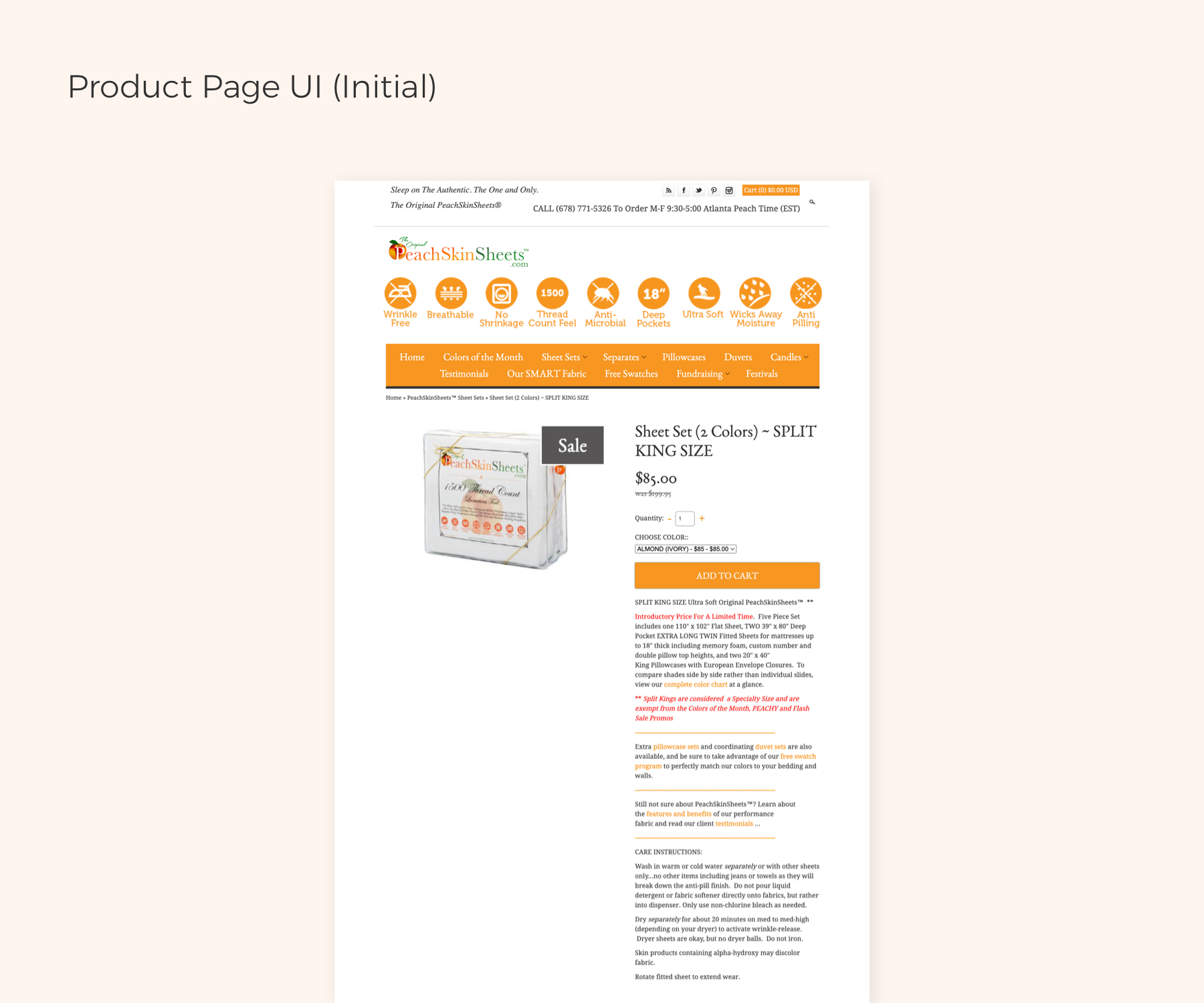
PeachSkinSheet.com In 2015
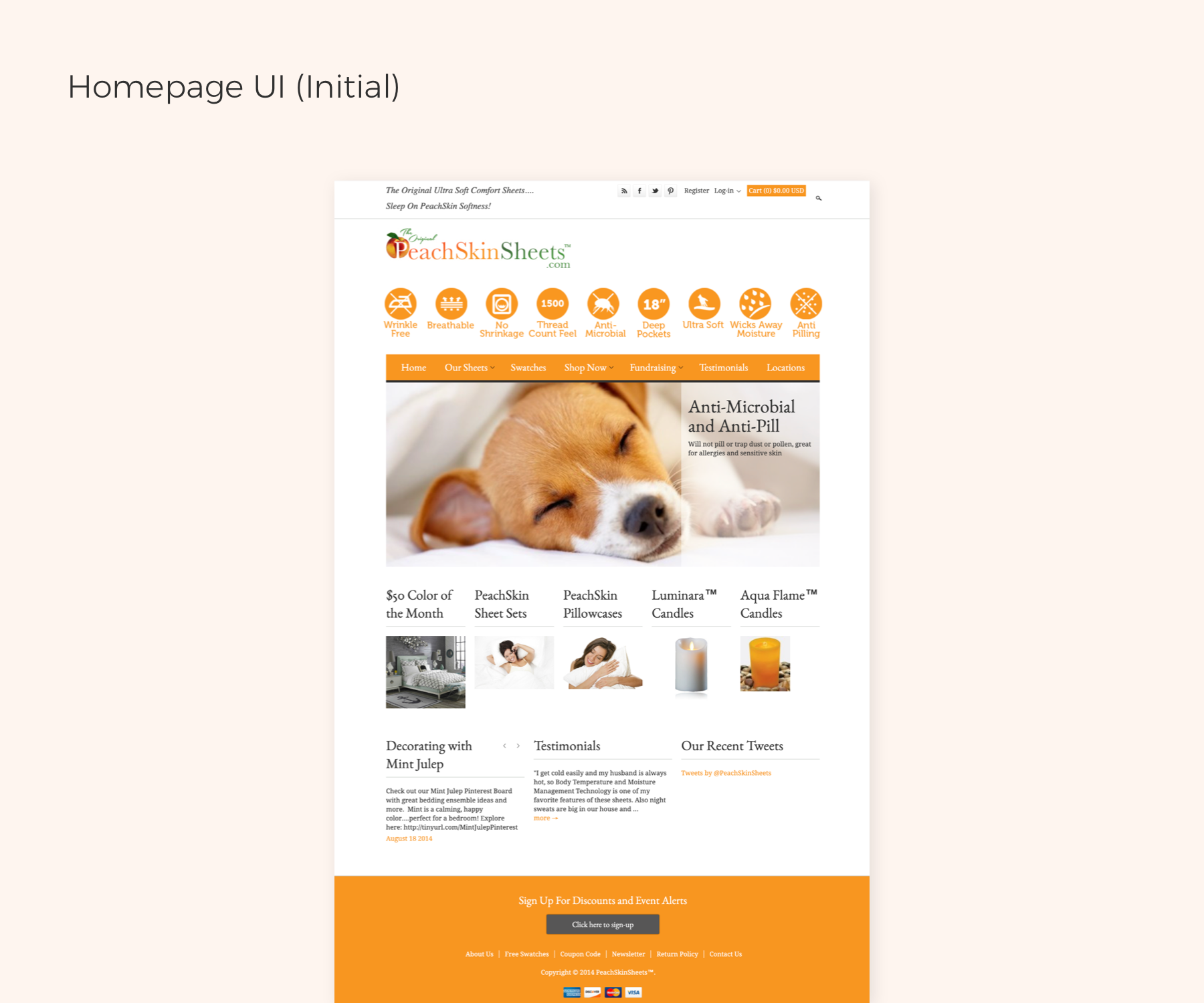
- UI was outdated and didn’t reflect PSS’s brand
- Almost half of PeachSkinSheets' traffic was on mobile, but 90% of orders were placed through desktop because their e-commece site was not responsive.
- Conversion rate is only 1% due to laggard/unpleasant shopping experience.
- High bounce rate - people spent very little time on the site
So Karen reached out to our company, and ask our help for a better ecommerce website. Karen was also looking for help on the marketing side.
Challenge
Despite knowing that a new professional e-commerce site was necessary for PeachSkinSheets, Karen was strongly attached to the appearance of her initial website and desired to keep all the old content on the homepage. Convincing her to make changes and improve the website's design and usability required taking additional steps, such as just suggesting repositioning some of the modules on the site.
In 2015, PeachSkinSheets had a limited budget, so Karen focused primarily on email marketing to drive sales. However, due to the outdated website, this approach was not sufficient to improve the conversion rate. To enhance the customer experience and improve the ROI, it was crucial to persuade Karen to take further steps to enhance the website's appearance and simplify the shopping experience.
Solution
- Create a professional responsive ecommerce website with exceptional user-centered design
- Optimized the site navigtion and make the shopping expercince easier.
- Rebuild the website by iterations. This approach will not only help increase the conversion rate and online orders but also build trust with Karen. As she sees the positive impact of each iteration, she will be more willing to increase her budget for revamping the website further. This will enable us to make more significant improvements and optimize the customer experience, ultimately driving even more sales and ROI for PeachSkinSheets.
- Iteration 1: Start with a basic UI/UX update based on a shopify theme, but still a well functioned site.
- Iteration 2: Build a fully customized e-commerce site that aligns with the brand's identity and value, expolor more brand personalities. Addresses primary usability issues based on the usability questionnaire.
Process
Research
PeachSkinSheets has a wealth of customer reviews that provide valuable insights into the reasons why people love the brand and help to define its customer profile.
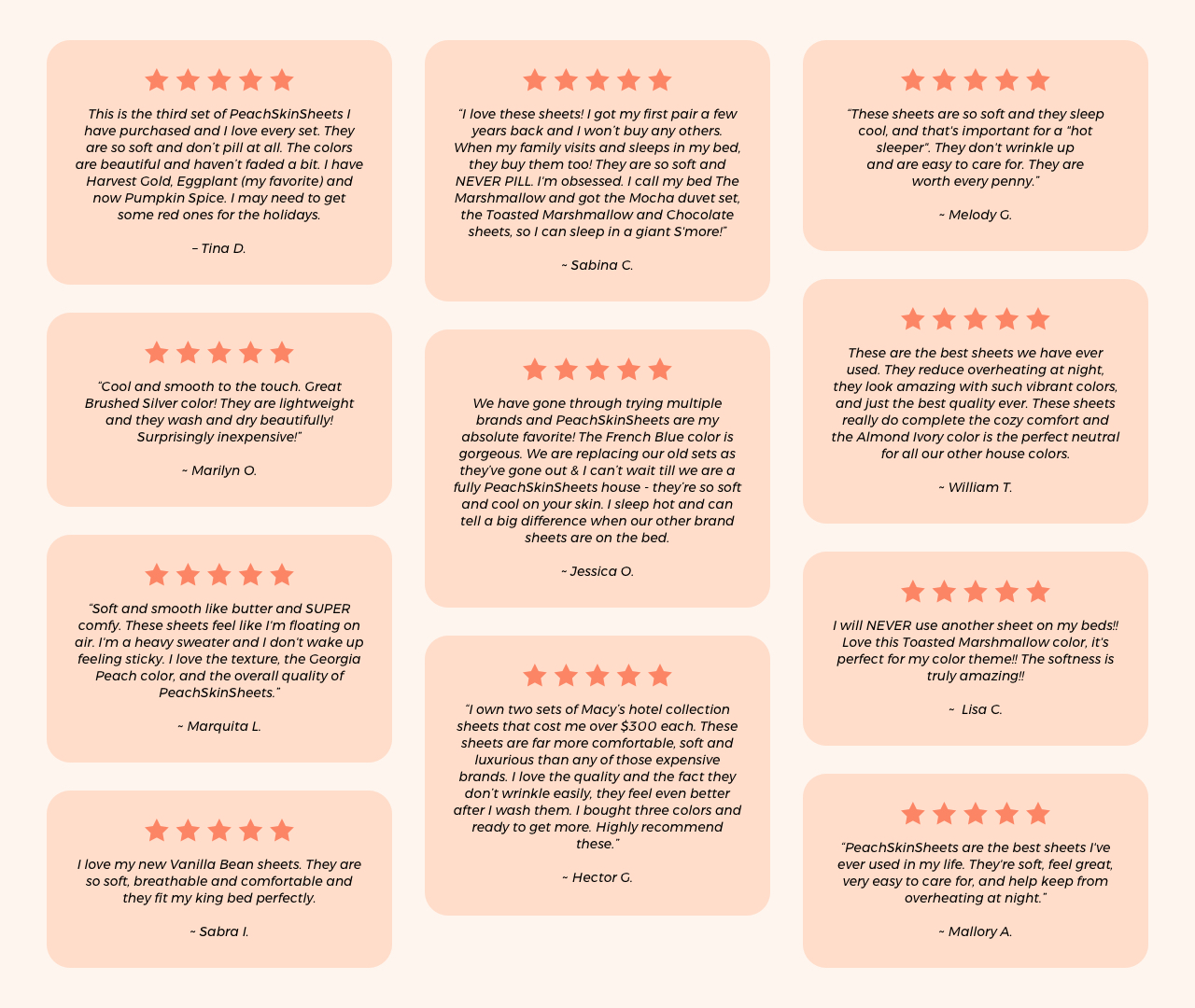
After classifying and analyzing verified customer reviews, I have identified the primary reasons that PSS’s customers care about the most.
Define
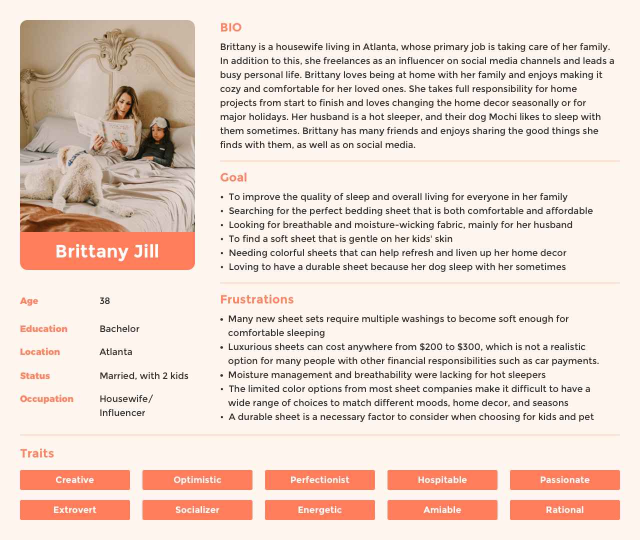
| User Persona
Ideate
Redesign: Iteration 1
Iteration 1 was a temporary solution that we provided to PeachSkinSheets (PSS) to address the challenges we identified earlier: 1) Karen's strong attachment to the appearance of her initial website, and 2) PSS's limited budget. This approach provided an opportunity to showcase the potential benefits of a UI/UX update on website performance and sales revenue.
To minimize the costs of Iteration 1, we decided to skip UI/UX research and wireframing, and instead started with a basic UI/UX update using a Shopify theme. However, even with this approach, we were able to improve the website's functionality through refined color palettes, improved navigation, and a responsive design. Once we complete Iteration 1, we will have a great opportunity to conduct a usability test and further refine the site.
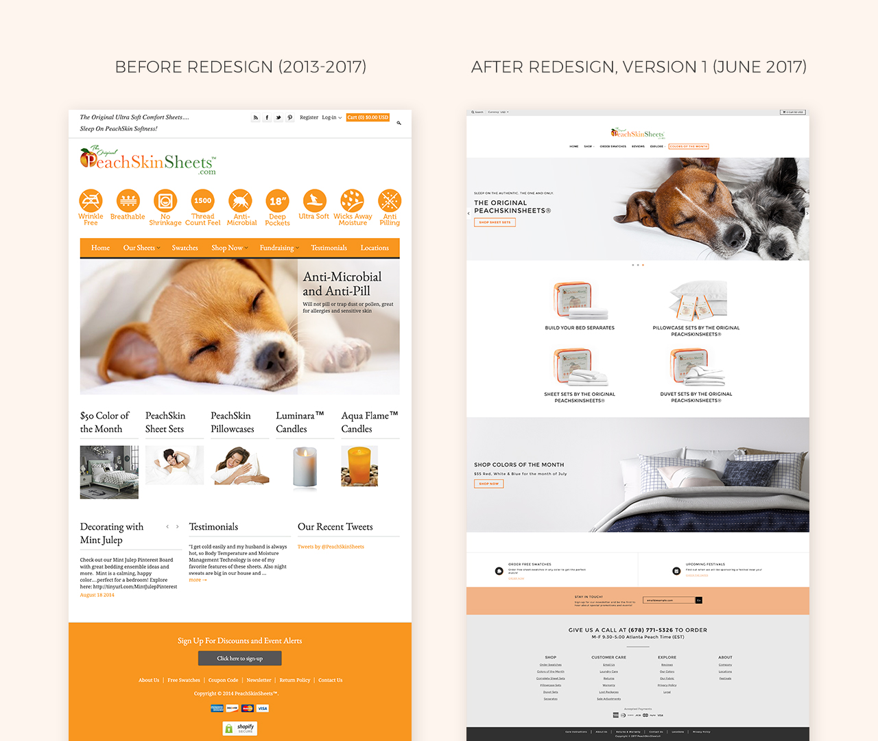
Following we launched the new site, a few months later, we've achieved positive statistics that demonstrate the effectiveness of Iteration 1. Specifically, we have seen an increase in website traffic, longer user session durations, and a considerable increase in sales revenue for PeachSkinSheets. These favorable outcomes serve as evidence of the significant impact of the UI/UX update and affirm the potential for further improvements through usability testing and refinement. We look forward to continuing to work with PSS to optimize their website further.
Redesign: Iteration 2
Karen was very pleased with the results of iteration 1 and has expressed her willingness to move forward with a fully customized e-commerce site for PSS.
To enhance the PeachSkinSheets customer experience and boost sales, it's crucial to create a fully customized e-commerce site that aligns with the brand's personality and showcases its unique qualities. By developing a website that accurately represents the brand's identity and values, we can provide a more cohesive and memorable shopping experience that fosters customer loyalty and encourages repeat business.
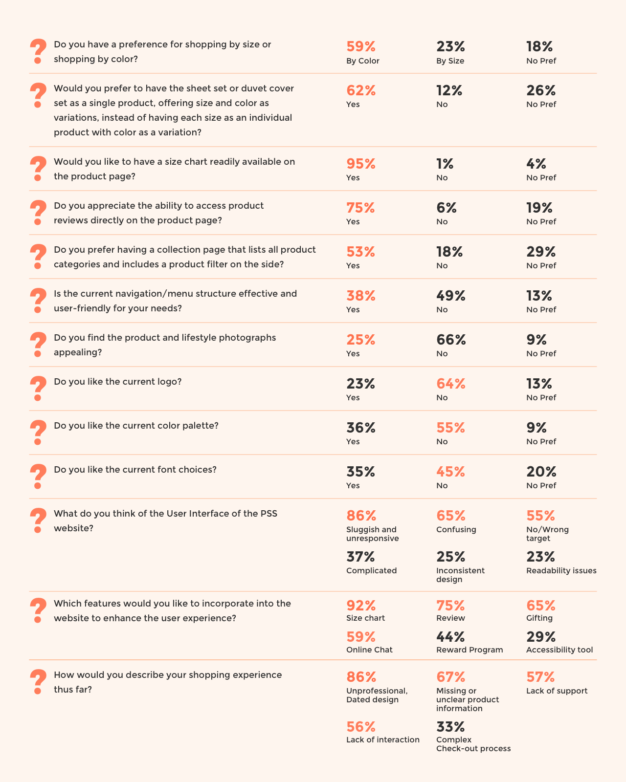
To ensure the new site addresses primary usability issues, we conducted a usability questionnaire to identify areas that require improvement. By collecting user feedback and analyzing the site's functionality and ease of use, we can identify priority pain points or areas for improvement and refine the site accordingly. This approach will enable us to optimize the user experience and improve the site's overall conversion rate, ultimately driving more sales and revenue for PeachSkinSheets.
| Usability Questionnaire
| Wireframe
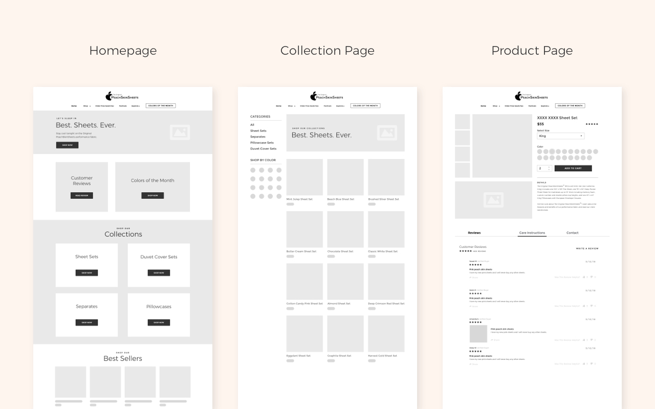
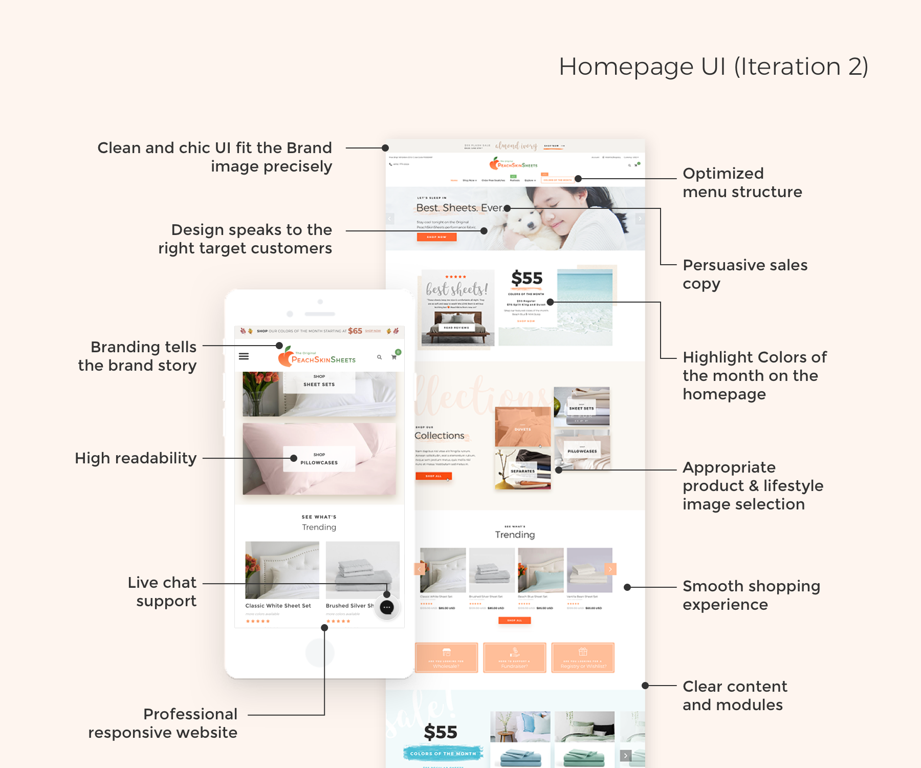
| UI Design (Iteration 2)
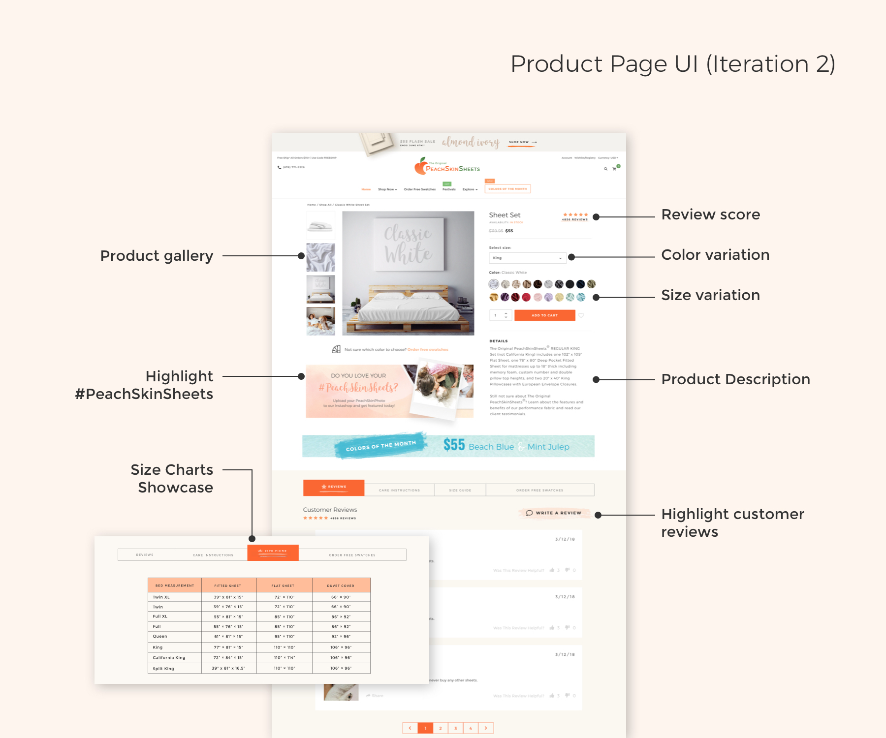
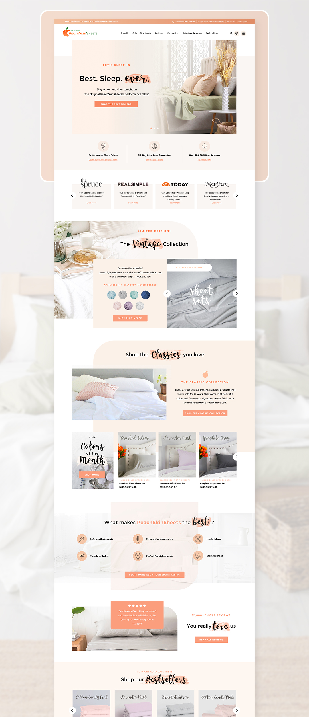
Based on the valuable feedback we received, we have taken decisive measures to refine and enhance PeachSkinSheets' website. As a result, we embarked on an extensive redesign of the e-commerce site, completely transforming it into a fully customized site utilizing the robust capabilities of the Shopify platform. The brand now boasts a visually appealing and modern appearance that seamlessly aligns with the new logo. Furthermore, the site's usability has been significantly improved, ensuring effortless navigation for users. With the introduction of new features such as a size chart, product reviews, online support, and a streamlined checkout process, users can enjoy an enhanced shopping experience with improved interaction and convenience.
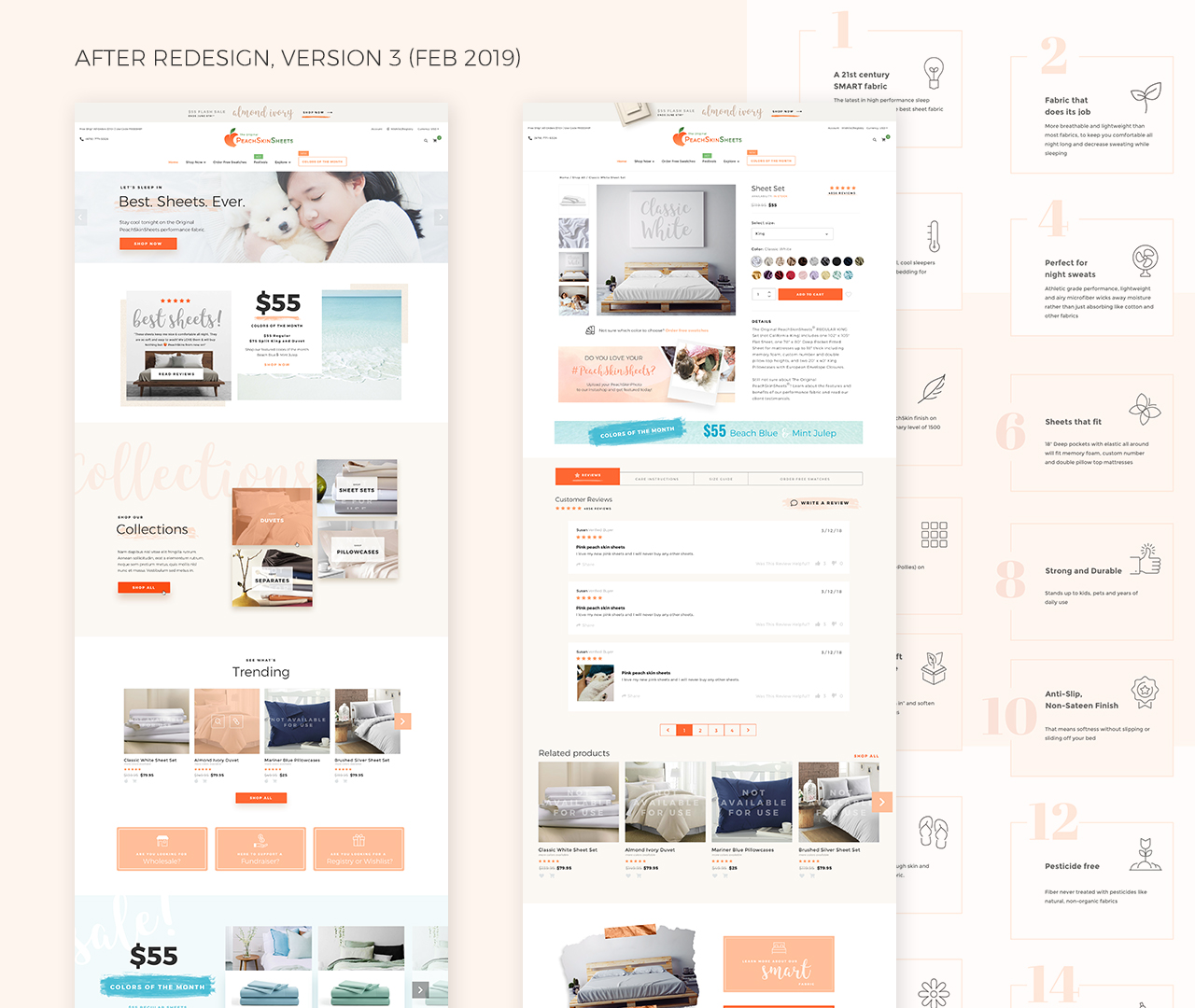
Homepage
Collection Page
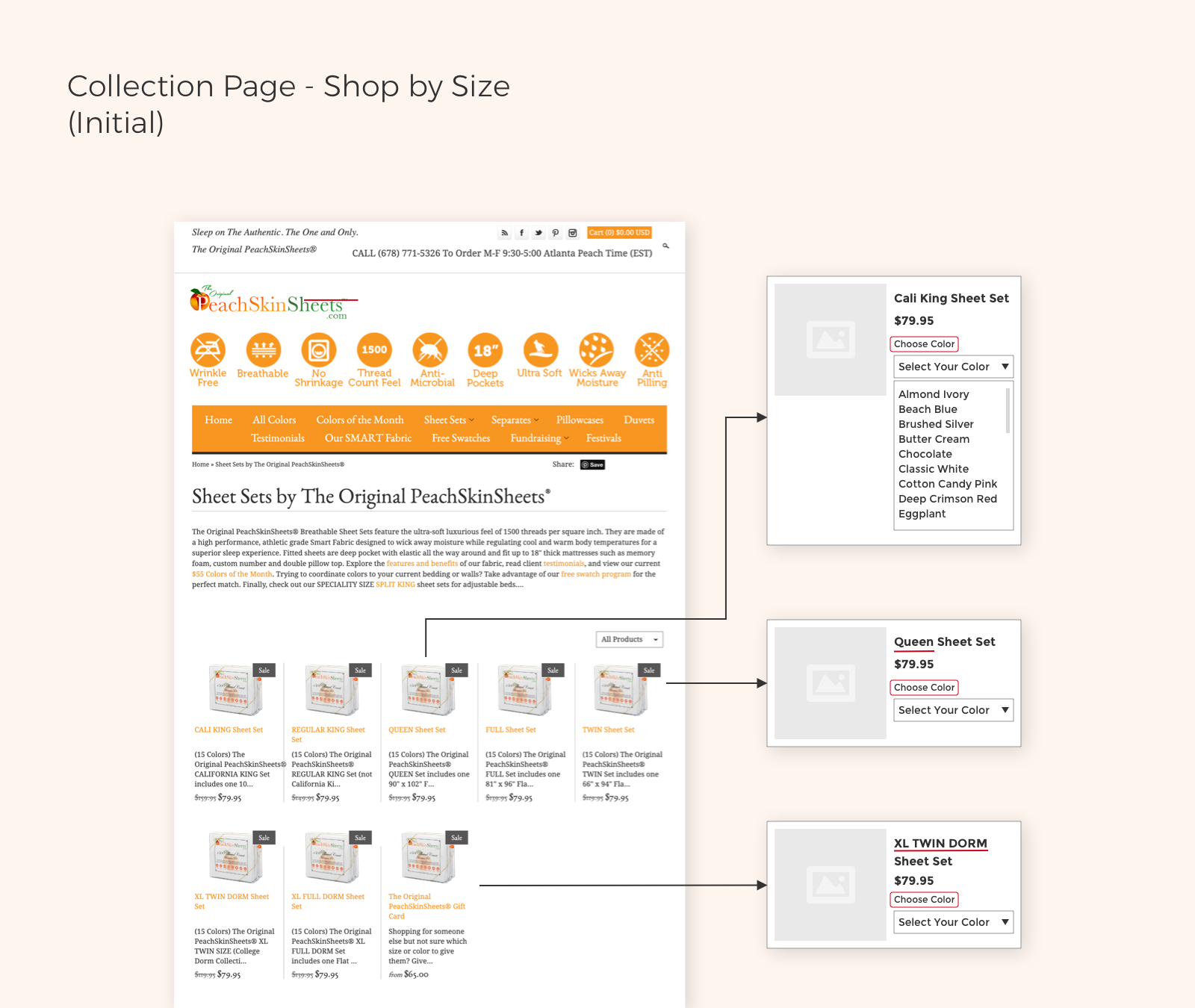
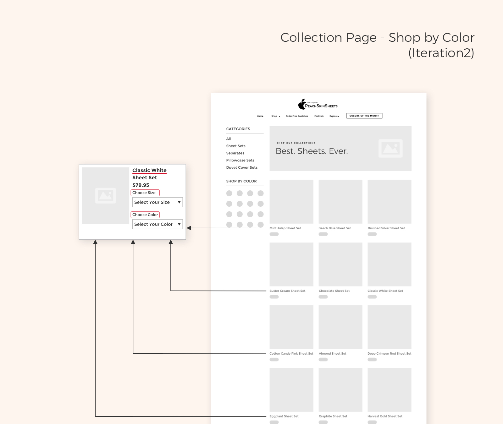
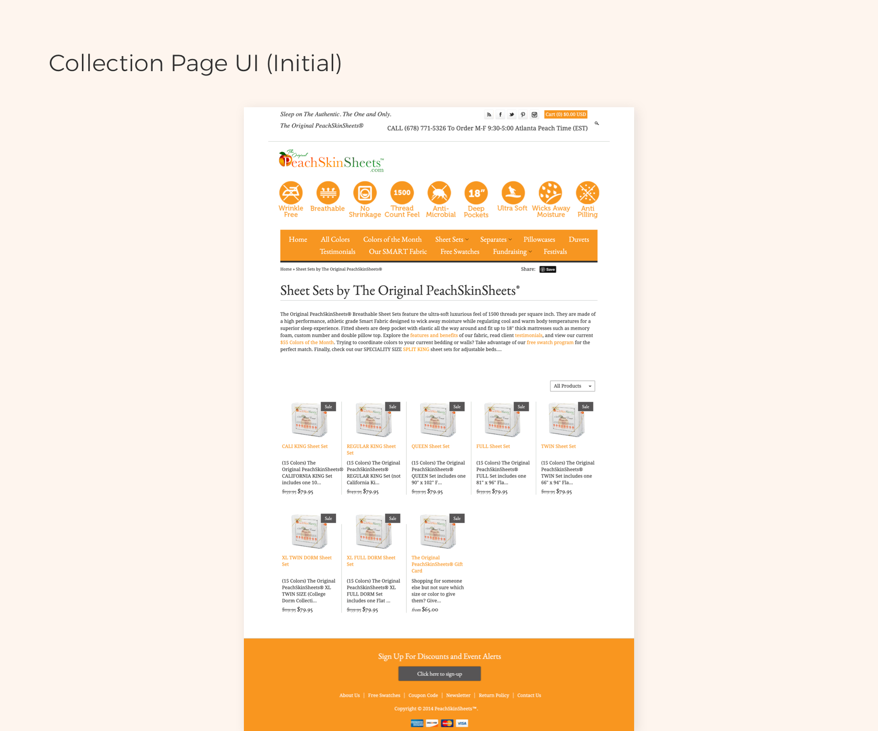
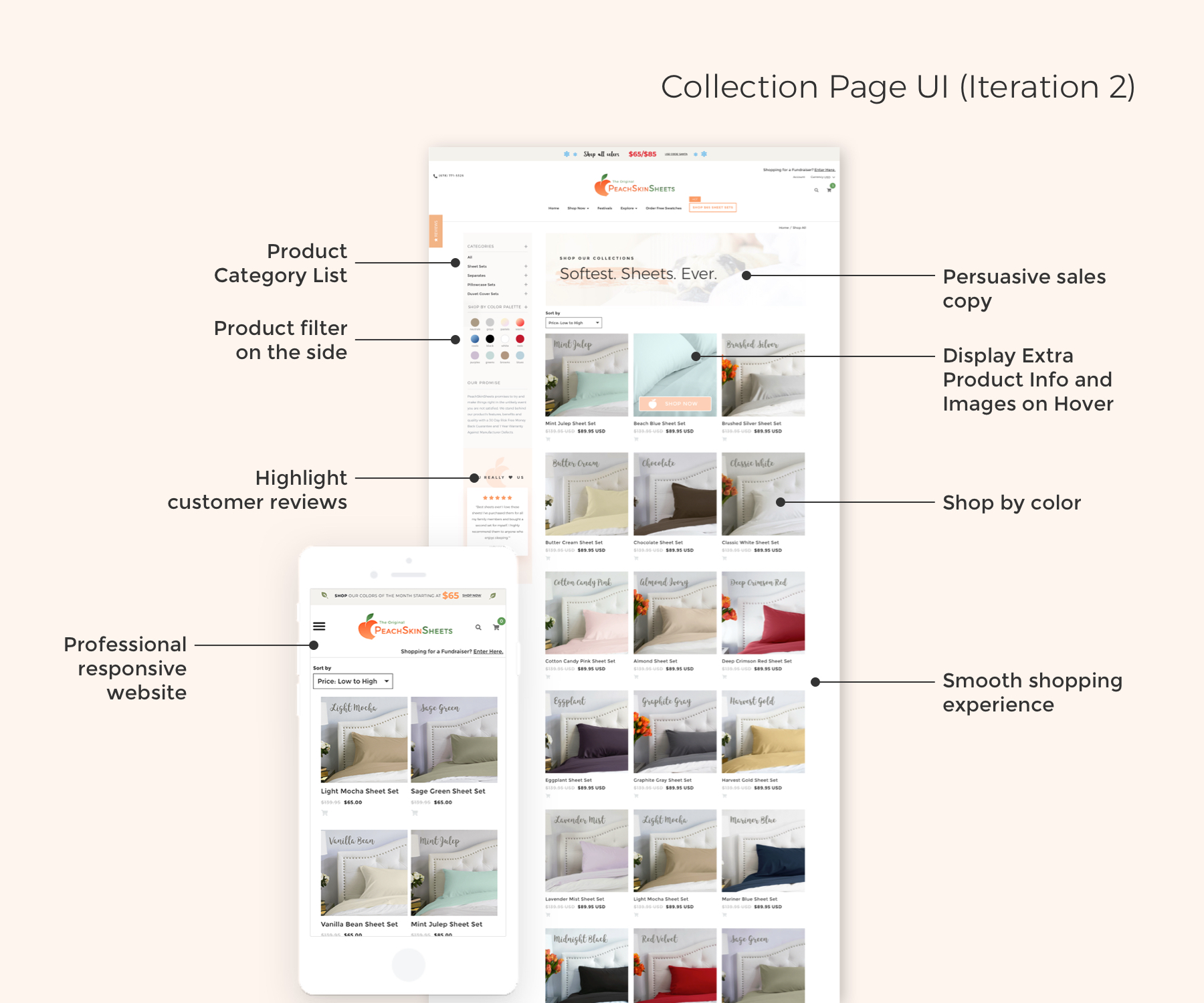
Product Page
Redesign: Iteration 3
In February 2019, Iteration 2 was launched, and the impressive statistics that followed were a clear indication of its success.
Redesign: Iteration 4
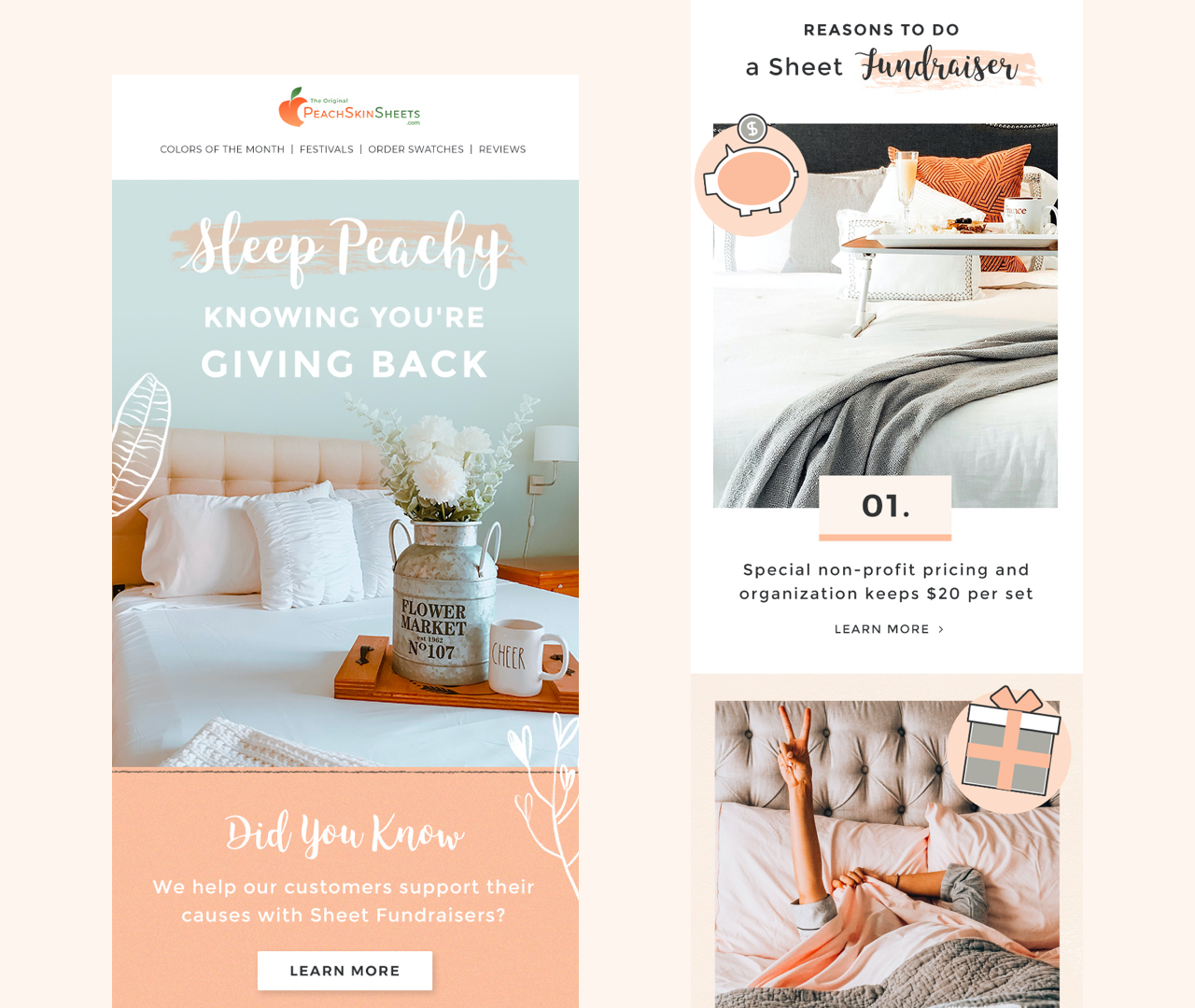
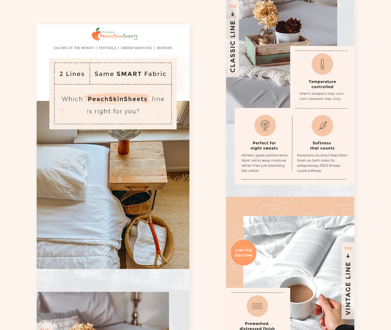
Email Design
Overview
Through a comprehensive plan involving rebranding, a newly designed and mobile-optimized ecommerce website, and integrated marketing services including intelligent email as well as social media marketing strategies, PeachSkinSheets has increased their following across platforms and driven more traffic to the website.
Client
PeachSkinsheets.com
Year
2015 - Present
Tags
